Organic Dreams
UX|UI Designer / UX Researcher
Organic Dreams
UX|UI Designer / UX Researcher
About Organic Dreams
An online store offering sleep products and accessories are presented on this website as a hypothetical project. This website provides users with sleep products that improve their quality of sleep. Our design considers the requirements and limitations of a hypothetical employer, as well as the user’s needs and easy access to product categories.

Our Goals
- Finding the suitable product based on the user’s physical needs (common sleep problems)
- The appropriate introduction of products
- An e-commerce website that design adaptively in both desktop and mobile versions
- Incorporating the value proposition of the brand in designing the website


Value Proposition
- Improving sleep quality
- Guide users to the best product based on personal needs
- Organic fibers and scents
Target Market
- Who requires a platform which provides all the sleep products they are looking for
- All users who care about the quality of their sleep
- Users who have restless sleep
- +Also, they are willing to pay more for organic product
Challenges
According to the research, we realized the users’ challenges in choosing their appropriate products:
- Identification of fabrics
- Matching the sheet color with their space
- Detecting the softness and firmness of mattresses and pillows
- Choosing a mattress protector that is the right size for their mattress

Questionnaire (Quantitative data)
16 questions were designed in order to identify:
- target market
- users’ demographic information
- expectations of suitable sleep products
- prioritizing the purchase of sleep products
- online shopping experiences of sleep products
Among 109 people who answered the questionnaire, 77 people remained after screening questions.
Example: As a result of the answers to question NO.10, we developed an Information Architecture that reflects the customer’s purchasing priorities.
Interview (Qualitative Data)
The interview questions are asked to understand the challenges and needs of the target market while purchasing sleep goods online.
After analyzing data through affinity diagram, the following results are obtained:
- The possibility of choosing a mattress/pillow according to their needs (measurement of firmness and softness in online shopping, physical problems)
- Ensuring the quality of the product
- Exact size and dimensions
- The possibility of setting the color of the bedspread based on the bedroom
Competitive Analysis
A competitive analysis of eight sites was done at this stage, and the features used on the site were modified and made more efficient.
According to our customers’ needs, the most important result was sleep quiz feature that enables users to find their suitable products easier.

Brain Storming
After gathering the necessary data, the team and I were able to come up with several options throughout numerous brainstorming sessions to address user and business challenges:
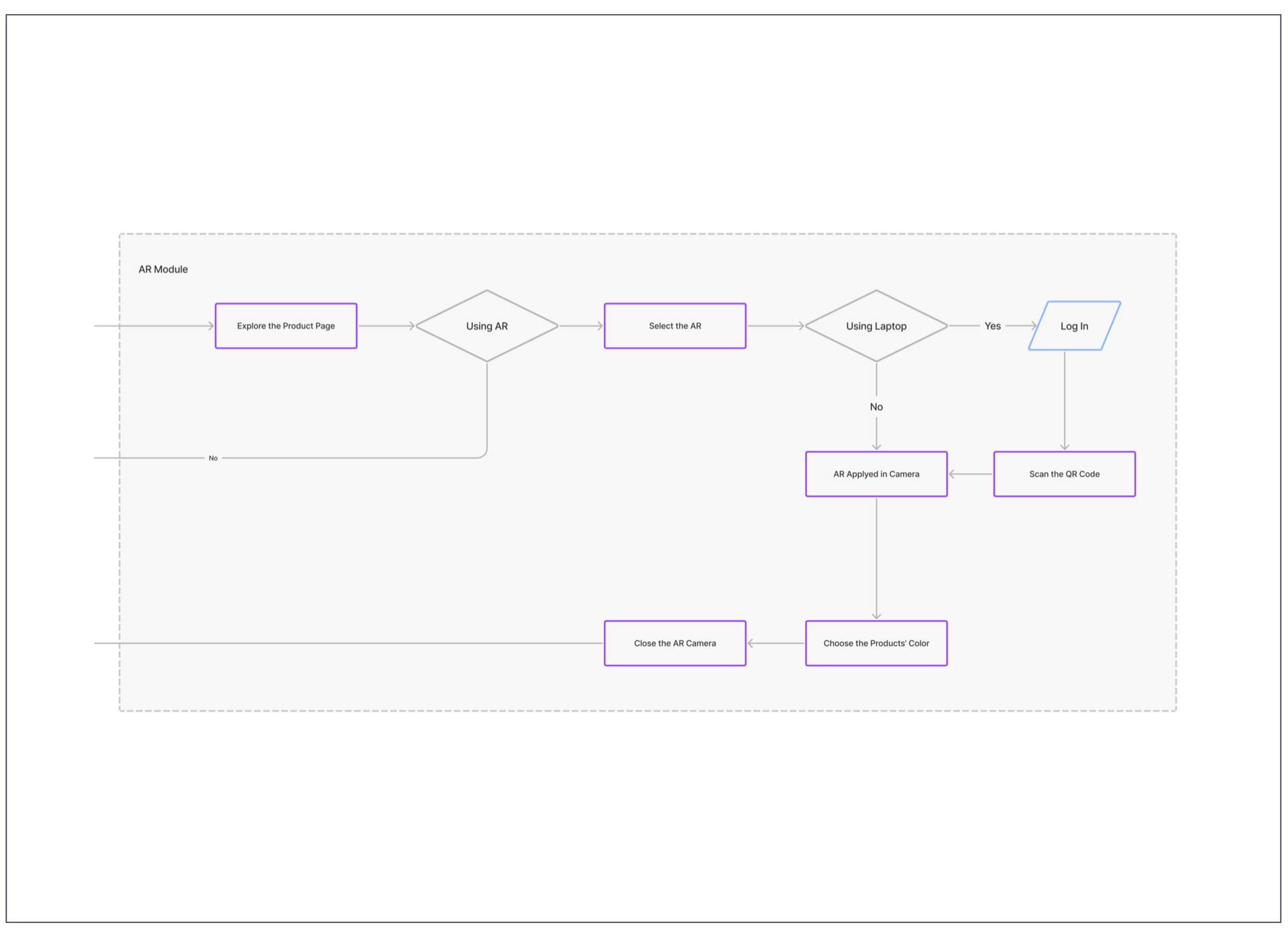
- Using AR technology to solve the problem of matching the bedspreads’ color
- Designing the mattress/pillow quiz, to help users in selecting the optimum product for their physical condition
- Adding the “Buy Mattress Protector” option on the selected mattress page
- Providing high-quality images and videos of fabrics to recognize the product’s material clearly
- Dedicating a special section for fabrics for ease of selection

User Flow
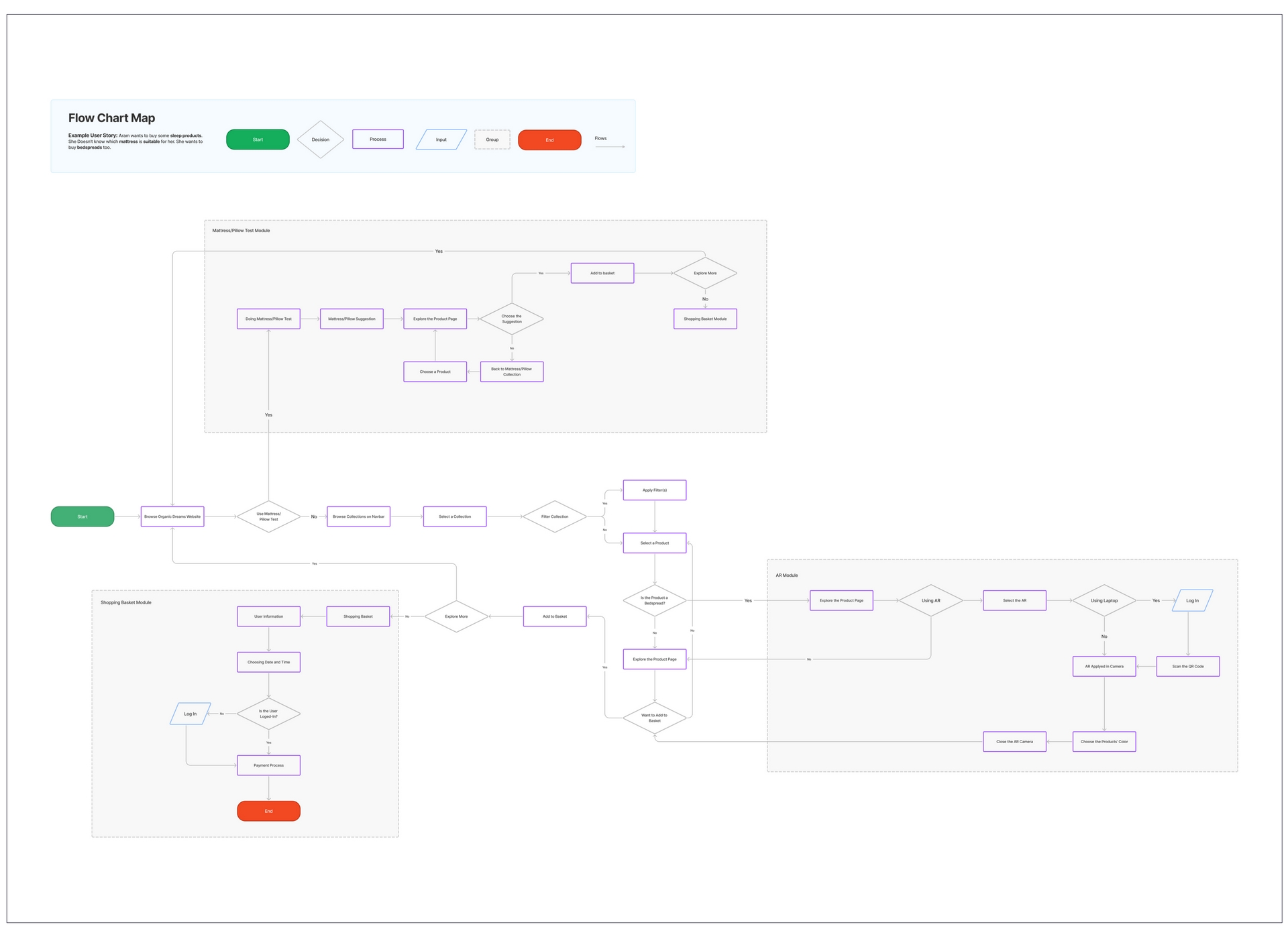
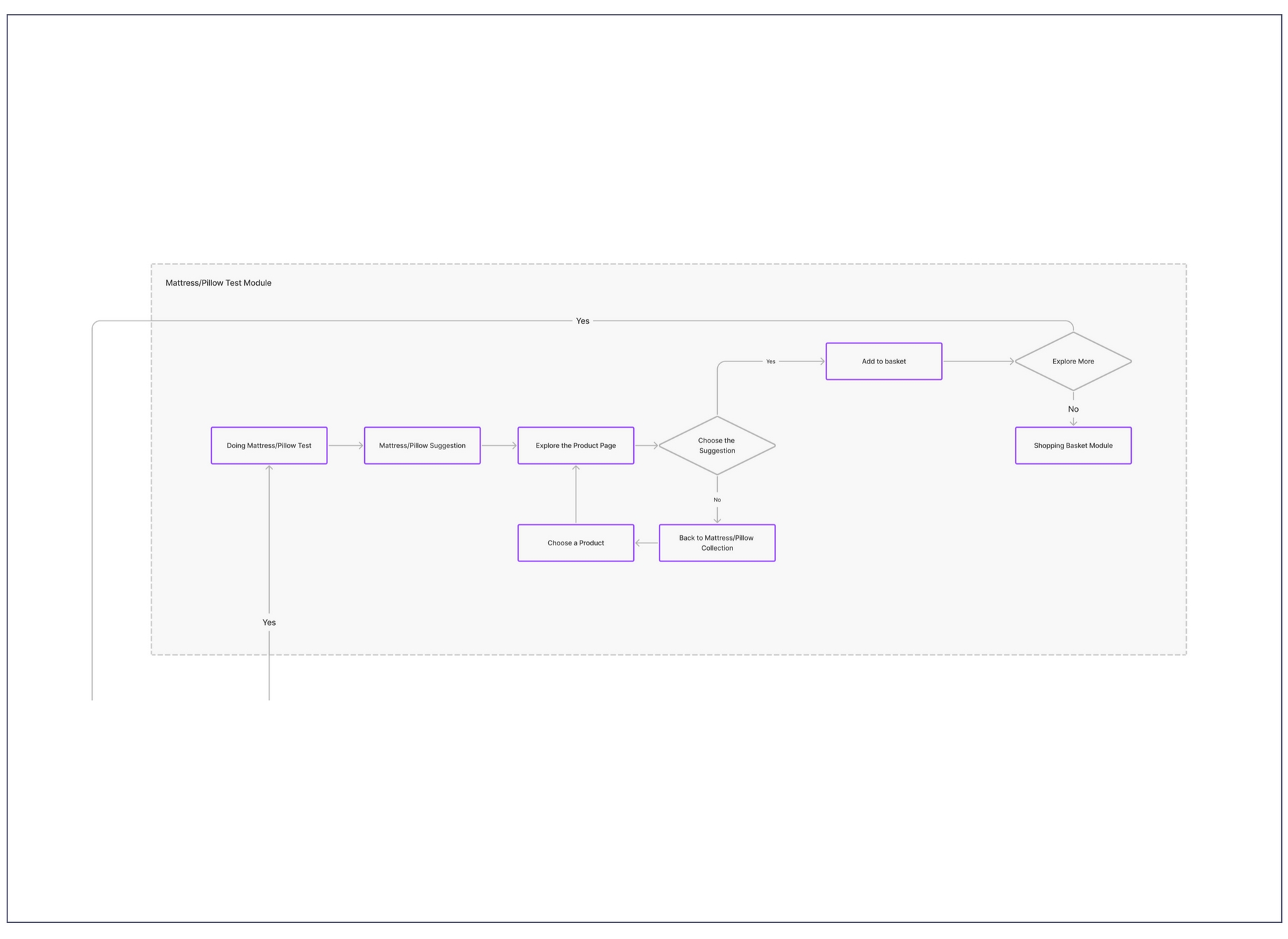
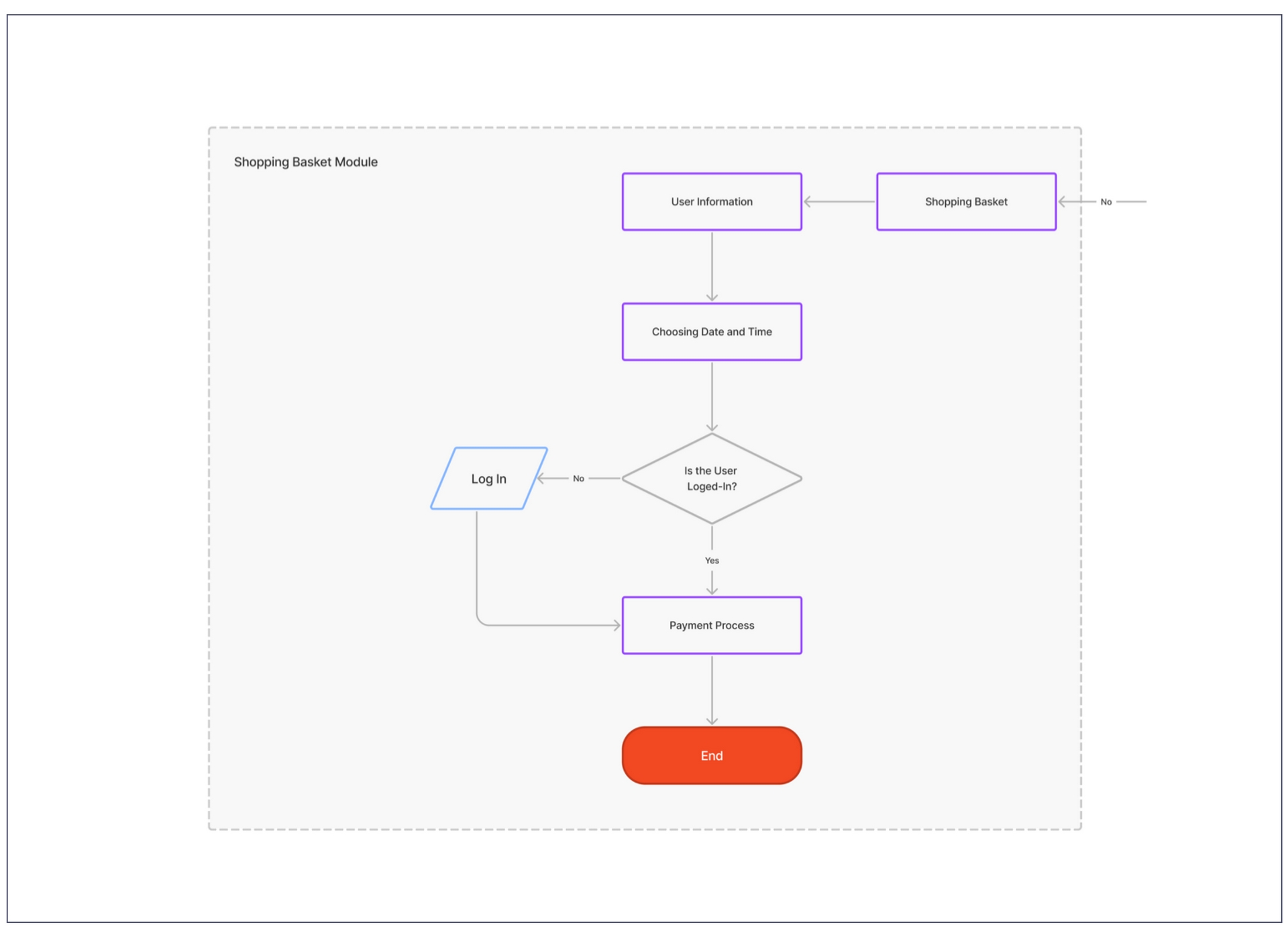
Considering Aram needs and the project goals, I constructed a user flow that describe the pathways user might take while purchasing an item. This process helped me in:
- Identifying the key screens and actions users might require
- Understanding ways users can interact with the product
- Allowing me to see navigation through user goals
The result of card sorting is in the following diagrams:
Sitemap
Based on the information architecture, the main pages and the placement of the main features of the site were determined. Also, the way to connect the pages was specified:

Sketches
Diving into sketching, I started the design stage by sketching Preliminary sketches with little to no detail were created at this point in the design process. The sorting card, site map, and user flow formed the foundation for designing the layout and sections.
Wireframes
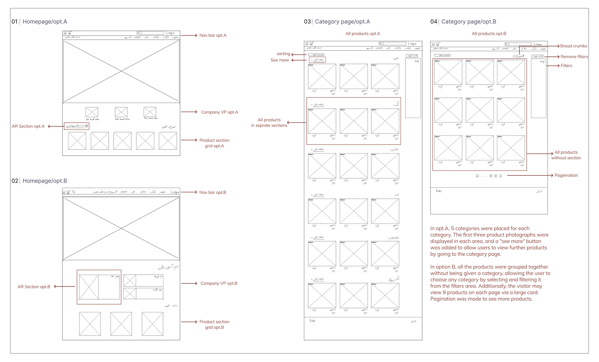
Mid-fidelity wireframes were created following the initial placements and sketches so that usability tests could be used to evaluate how well the site’s features worked. Here are 3 examples:
Hero Image
After conducting usability testing, we discovered that this type of hero image was confusing users, who perceived the site as being related to interior design rather than sleep products. To remedy this, we selected a new image that conveyed the message of sleeping and relaxation more effectively.
Product Listing Page
Usability testing revealed that our long-scrolling product listing page was overwhelming for users. To improve the user experience, we added pagination to break up the content into smaller, more manageable sections. This change helped users more easily navigate the products and find what they were looking for.
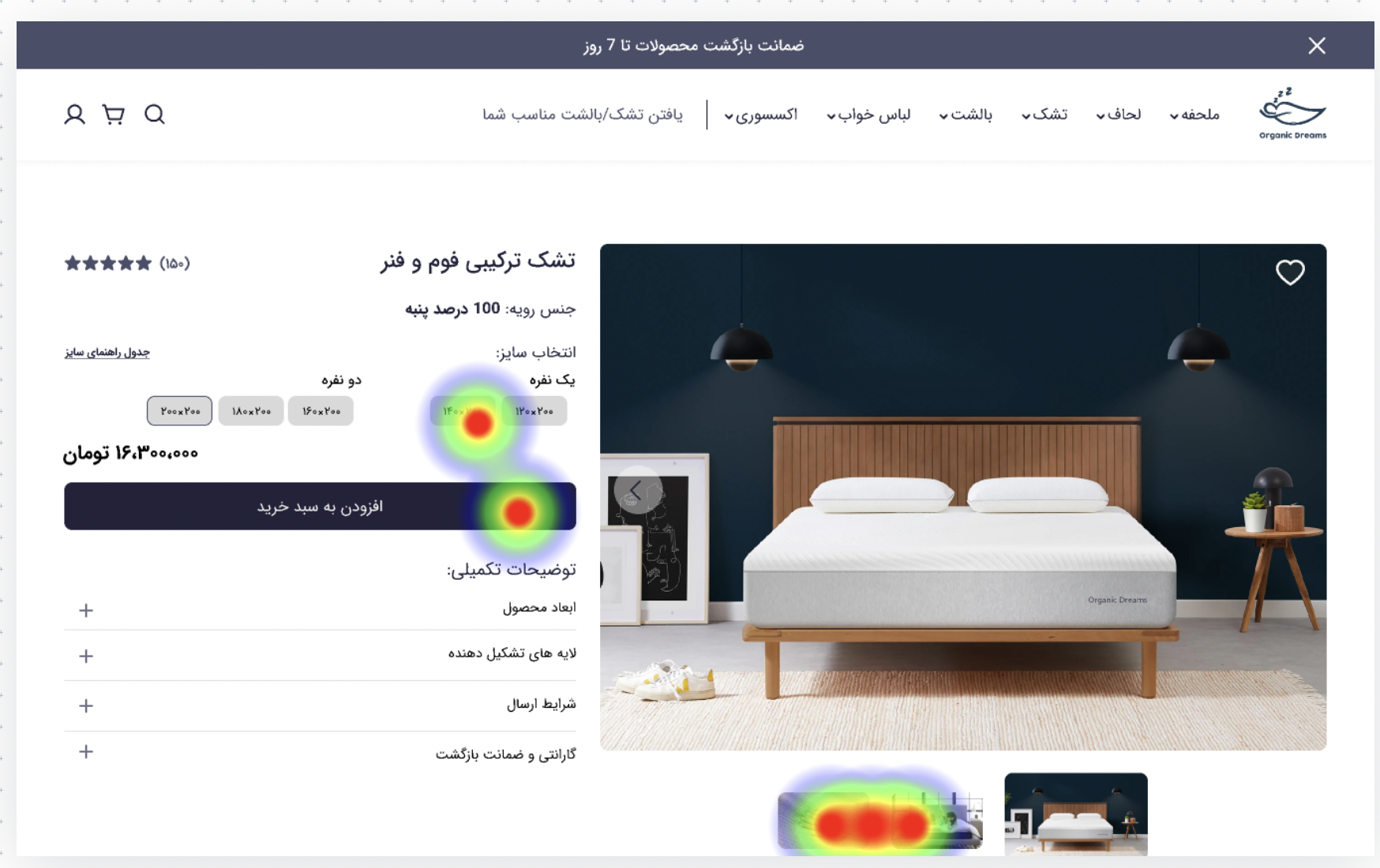
Mattress Page
We iterated our product page based on user feedback. We moved the product descriptions and size selection to a more prominent location to improve visibility. Additionally, we added a feature to select a matching mattress protector based on user research. These changes resulted in a better user experience and increased sales of related products.
Mood Board
During our mood board session, we explored a collection of visual elements that helped establish the look, feel, and tone of our brand. By examining the mood board we had created, we discussed how it reflected our values and objectives. We looked at the visual elements we had chosen, such as colors, textures, and imagery, and analyzed how they worked together to create a cohesive brand identity.
UI Kit
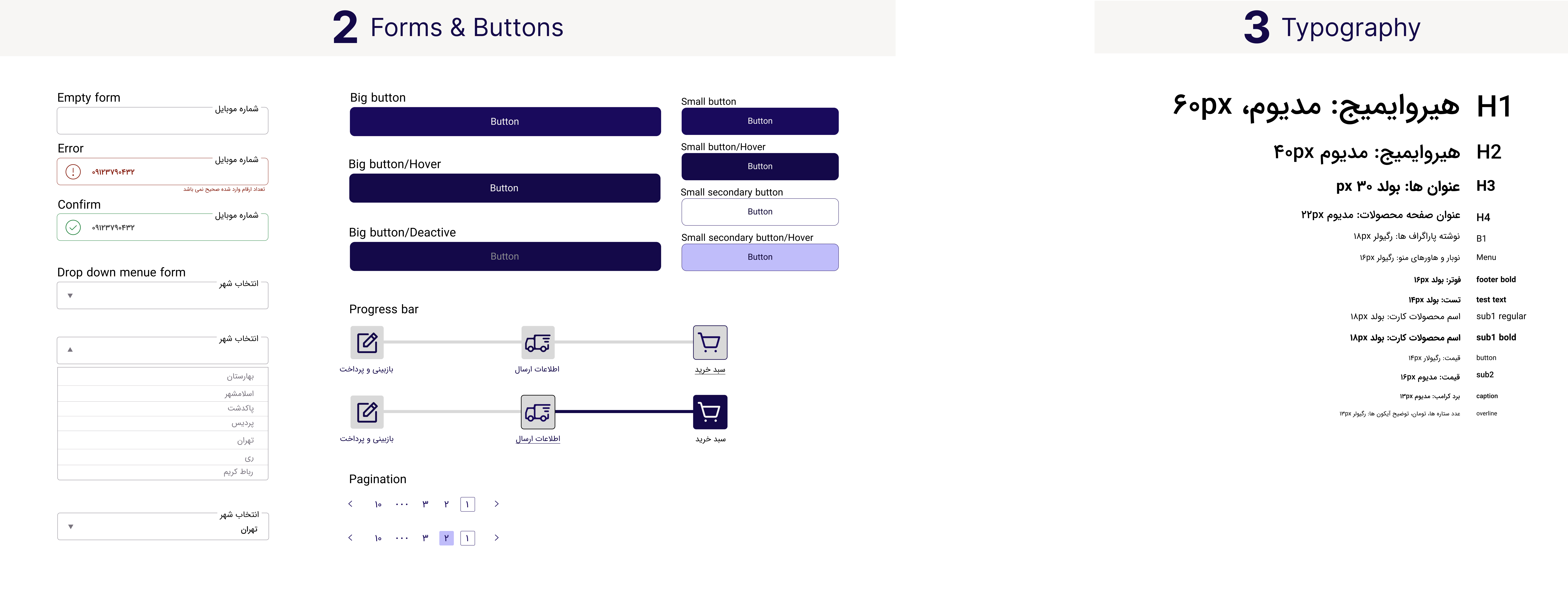
We created a UI kit to improve our design process and maintain a consistent brand image. The kit included essential components such as buttons, forms, and typography. During the session, we showcased the different elements of the UI kit and demonstrated how they could be utilized to create a cohesive and visually appealing interface.
Product Cards
We created a UI kit to improve our design process and maintain a consistent brand image. The kit included essential components such as buttons, forms, and typography. During the session, we showcased the different elements of the UI kit and demonstrated how they could be utilized to create a cohesive and visually appealing interface.

Forms & Buttons
Our kit featured active and inactive versions of buttons with two distinct designs, primary and secondary, based on the background color of the page. This allowed us to maintain a cohesive visual identity and improve user experience by clearly indicating the status of the buttons. For our form designs, we focused on providing clear feedback to the user by including error and confirmation messages. These elements provided users with the information they needed to complete tasks accurately and efficiently, improving overall satisfaction with our digital products.
Colors
Our mood board features a color palette that’s designed to evoke a sense of calm and relaxation. The muted shades of purple and gray communicate sophistication and elegance, while the soft cream and off-white tones add warmth and coziness to the palette. Together, these colors create a soothing and inviting atmosphere, which is ideal for a brand that focuses on sleep products or other types of relaxation-oriented products. The color combination is often associated with nature which further reinforces the idea of relaxation and comfort.
Accessibility
Throughout our design process, we placed a strong emphasis on accessibility. We understood the importance of ensuring that our products were accessible to everyone, regardless of any physical or cognitive limitations they may have. To achieve this, we made use of various accessibility-related extensions and tools to check the accessibility of our design elements and ensure they met the necessary standards. We took great care to ensure that our products were easy to navigate and understand, with clear and concise labeling and sufficient contrast between text and background colors. Our commitment to accessibility ensures that our product can be used and enjoyed by as many people as possible, and we will continue to prioritize accessibility in all of our future design projects.

Tests and Iterations
Based on the usability testing, A/B testing, and 3-second testing, we made several iterations to improve our design and enhance the user experience. We also used Maze to conduct a final test, which confirmed that our design was working effectively without any major issues. Through the testing and iteration process, we were able to identify and address potential user pain points, streamline navigation, and improve the overall usability of our product.
Final Product
Throughout our design process, we placed a strong emphasis on accessibility. We understood the importance of ensuring that our products were accessible to everyone, regardless of any physical or cognitive limitations they may have. To achieve this, we made use of various accessibility-related extensions and tools to check the accessibility of our design elements and ensure they met the necessary standards. We took great care to ensure that our products were easy to navigate and understand, with clear and concise labeling and sufficient contrast between text and background colors. Our commitment to accessibility ensures that our product can be used and enjoyed by as many people as possible, and we will continue to prioritize accessibility in all of our future design projects.


